Driving behaviour change to reduce the cost per transaction.
GLX CARGO
For enterprise companies like Water Corporation, influencing how customers pay bills can have massive return on investment. As the UX Design Coordinator at Water Corporation, I was able to collaborate with both business-focussed and customer facing teams to identify opportunities to optimise one of the company's key cost-saving funnels: Direct Debit uptake.
Each customer signed up for direct debit payments meant cost savings per transaction, through reducing the customer's 'time-to-pay', and eliminating the risk of the customer not paying at all. Multiplied over close to a million transactions per year, the potential for savings was immense.
ROLE:
UX Design
UI Design
UX Research
COMPANY:
Water Corporation
YEAR:
2025 - 2026
Problem
Why optimise for direct debit uptake?
By collaborating with customer insights and customer service teams, I was able to identify that the digital experience with one of the most customer complaints was the process for setting up and managing direct debit. What this often meant was that instead of signing up for direct debit and costing the business $0.0X per transaction, frustrated customers would instead call up the customer service team (costing $X.XX per call) and/or diverting to another payment method (ranging from $X.XX to $0.XX per transaction).
NB: Exact cost numbers are redacted to maintain confidentiality but indicate rough comparisons.
Key Discovery Activities
User Flow Diagrams in conjunction with Google Analytics allowed me to pinpoint exactly where customers were abandoning the process. As a result I was able to target the screens with the most usability issues.
Design Workshops were run with cross-functional teams to identify potential technical and business constraints early on.
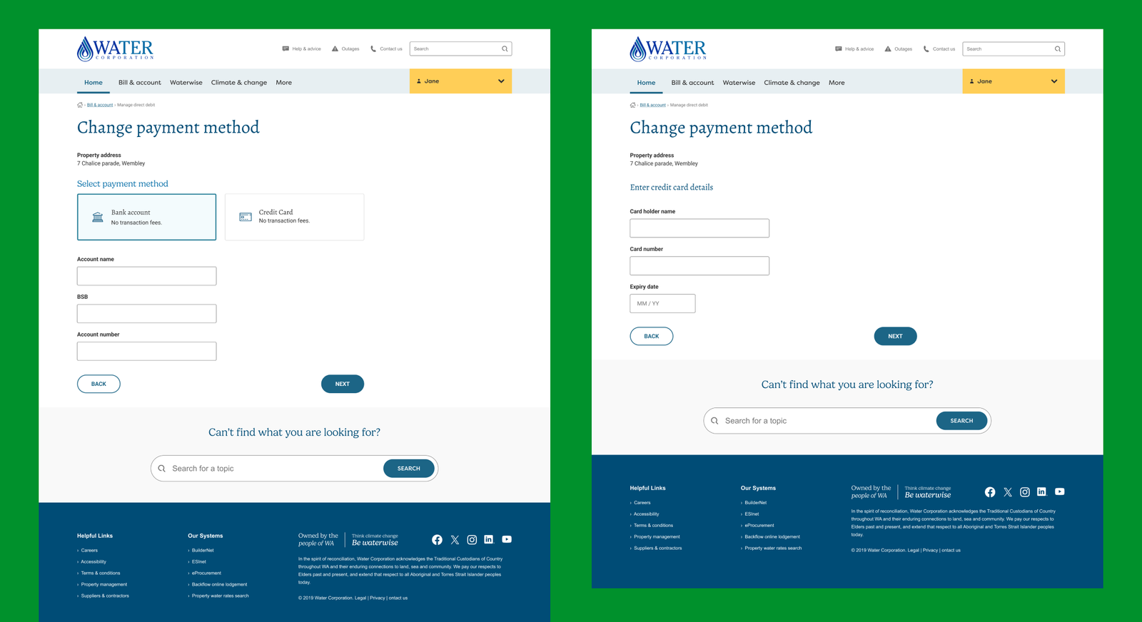
Competitive Comparative Analysis revealed that other utilities companies offered more compacted processes that allowed users to compare their options in a single place, rather than spread across many forms and pages. Additionally, making payment options more consistent with popular ecommerce platforms would increase usability through familiarity.
Key Ideation Activities
Wireframing was useful to present early designs to stakeholders and gain shared understanding while remaining focused on layout and content rather than styling.
Prototyping allowed us to demo designs to key stakeholders in order to get approval before even committing development resources.
Extensive Usability Testing with both desktop and mobile designs revealed usability issues unique to smaller formats. When selecting an appropriate action, it was important to have the most likely actions available in the first fold of the page.
Heuristic Analysis assisted the product team in methodically identifying areas of improvement. Having a structured framework for critique made it easy for non-designers to contribute to designs.

Key Insight
A truly 'set and forget' process
As a process most users encounter this experience only when moving into a new property, it was important to optimise the Direct Debit process for infrequent, often first-time users. This involved aligning the experience with other utilities and online providers, and improving the discoverability of each aspect of Direct Debit management.
Key Outcome
Simplifying
payment details
Workflows customised for commodities.
I was able to apply best practices for increasing payment conversion rates: only ask for necessary information, and accept whatever format the user is providing the information in.
NB: Some elements of the UI may not yet be in production.
I discovered that cargo operators distill complex information down to a few critical fields, and ensured that all key information is displayed in order of importance on a single screen. A multi-tabbed widget allows users to access tertiary information while keeping key details in sight. This 'Cargo Details' page formed the core of GLX Cargo.
[🍎] At a glance this page will tell you who is purchasing your apples, what type of apples they want, when you need to deliver the apples, where you need to deliver them to and how much you agreed to sell the apples for.
NB: Some elements of the UI have been altered to comply with NDA. Please contact me for more in-depth designs.
Key Outcome
Source of truth
for direct debit
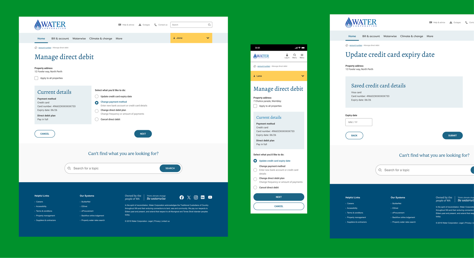
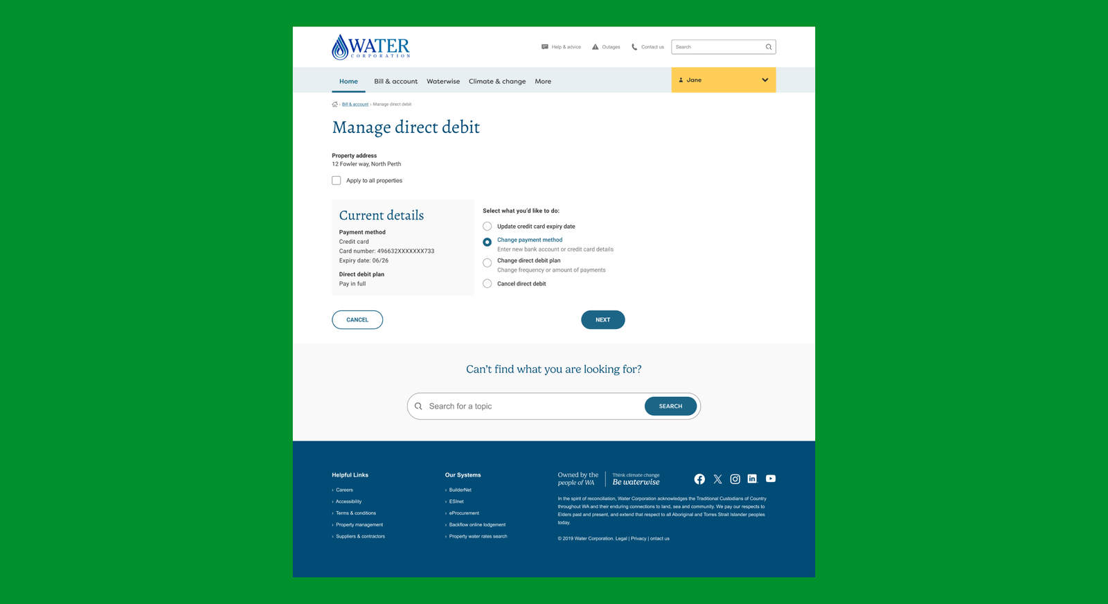
To address discoverability concerns, all actions were made available on a singular page, alongside current direct debit details.
NB: Some elements of the UI may not yet be in production.
Key Outcome
Transparent limitations and benefits
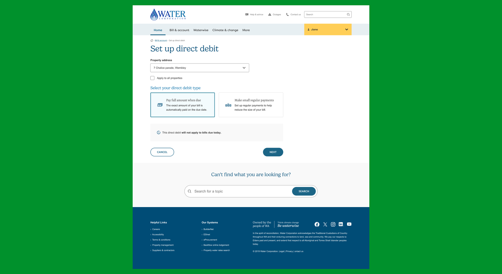
Hiding the limitations of direct debit on the final 'success' page was causing negative comments and reducing customer trust in Water Corporation. We were able to bring this information forward while showcasing the benefits of setting up direct debit (no transaction fees) early on in the process, to alleviate negative feedback and increase 'Voice of Customer' rating - a key business goal for Water Corporatioon.
NB: Some elements of the UI may not yet be in production.
Learning
Optimise for most common device
Early analysis through Google Analytics revealed that users managing Direct Debit through the Water Corporation website were evenly split between mobile and desktop. This meant giving an equal amount of attention to both formats, and usability testing both experiences in depth.
Learning
Access the experts
Coming from a startup environment I was previously used to wearing many hats. At Water Corporation however I was able to work with a wide variety of specialists from Customer Insights and Customer Experience teams who helped me elevate the quality of my UX Research and other outcomes.
GLX CONNECT
Product Design / UX Design / SaaS
Simplifying and de-risking counterparty negotiations for price discovery in emerging markets.